WARNER BROS TO NEW LINE | LOGO
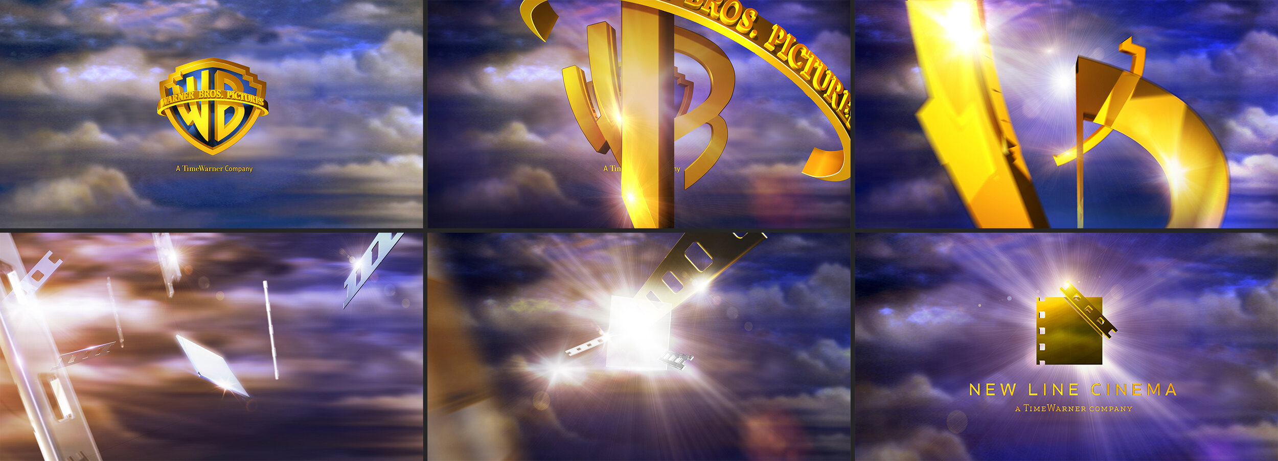
The task seemed straightforward enough: transforming the WB logo into the New Line logo. However, the sheer number of possibilities posed a challenge. Our goal was to strike the perfect balance between both logos, ensuring that neither overshadowed the other, despite WB being the more prominent one. To achieve this, we deconstructed the WB logo into its individual components, orchestrating them to seamlessly assemble into the New Line logo, all while maintaining the integrity of WB's environment.
